Choosing a perfect curtain color is more than just picking a fabric that matches your space, too. Because curtains decide how a room feels, how light reflects in the space, and how it affects your mood, too. Well, this color guide is specially designed to help you in a thoughtful approach for curtain selection, using mood, room type, and color psychology for making smart choices.
Whether thinking of redecorating or starting fresh. Identifying how to choose the perfect curtain color goes beyond just aesthetics. Do you want a relaxing retreat? A vibrant and social living area? This guide covers it all, from giving you room-specific curtain ideas and design tips grounded in both style and science.
Top 8 Ideas On How To Choose the Curtain Color For Every Specific Room

Here are some beautiful color curtain psychology that will add charm and personality to your home.
-
Living Room: Add Peace With Warm Earth Tones
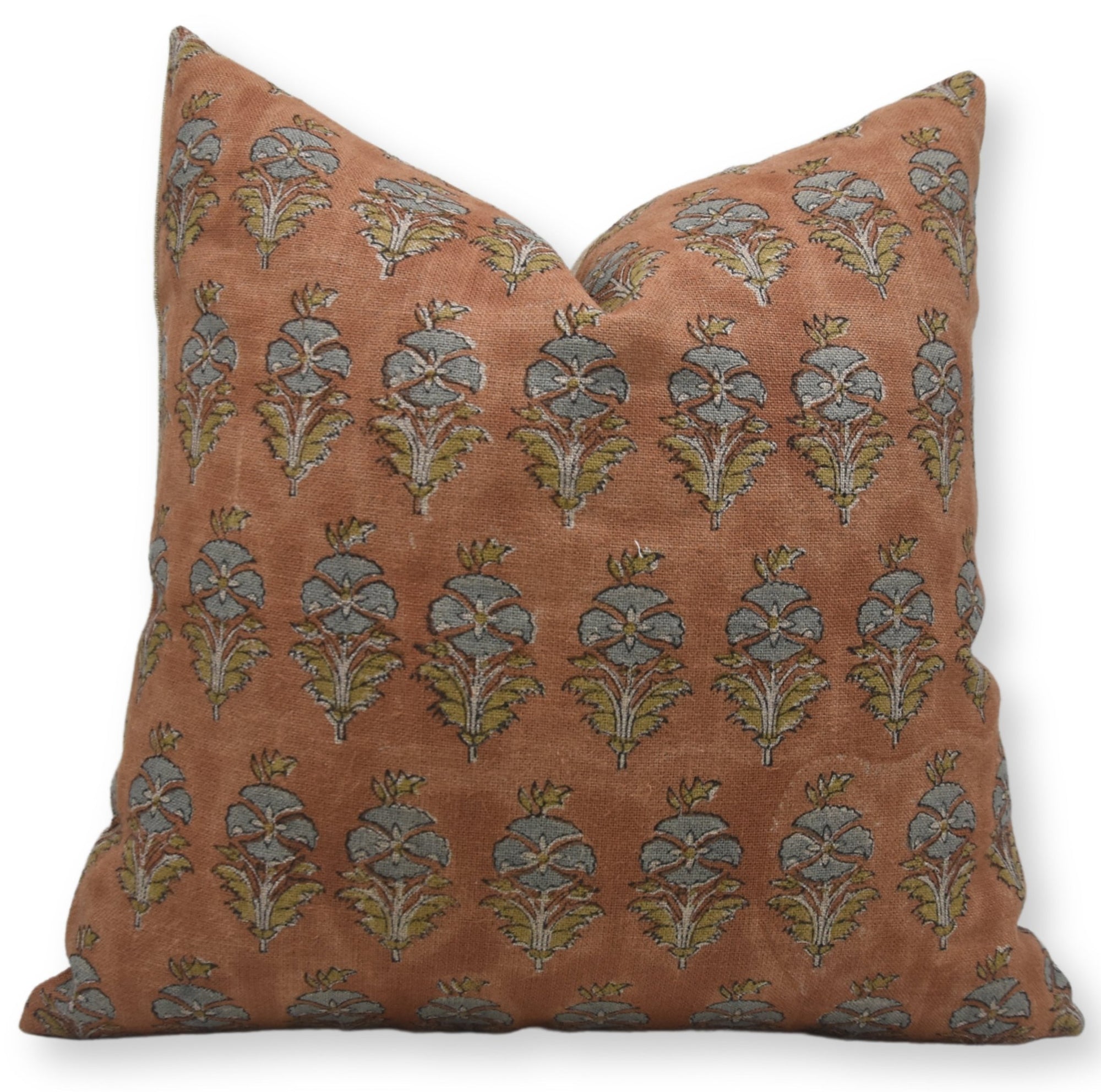
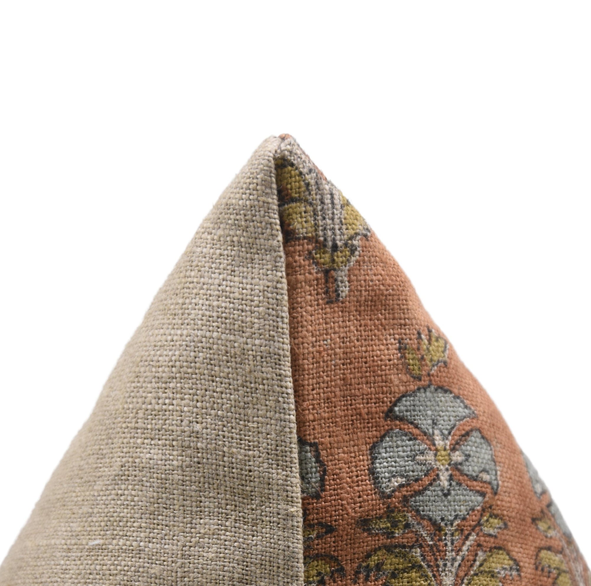
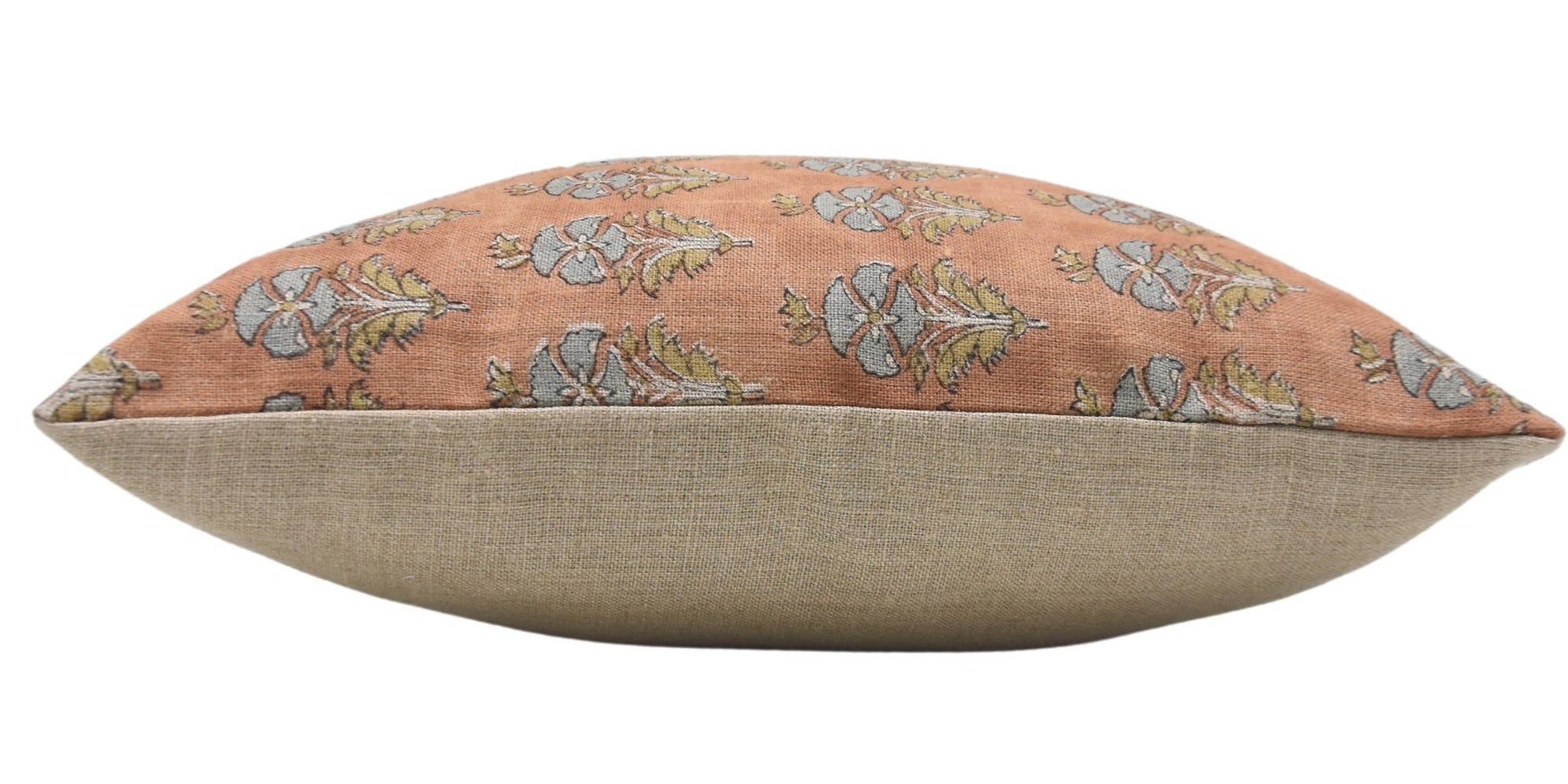
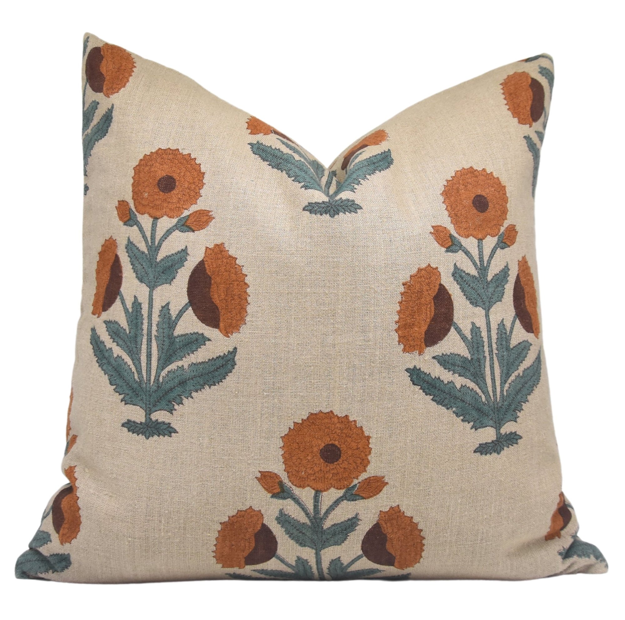
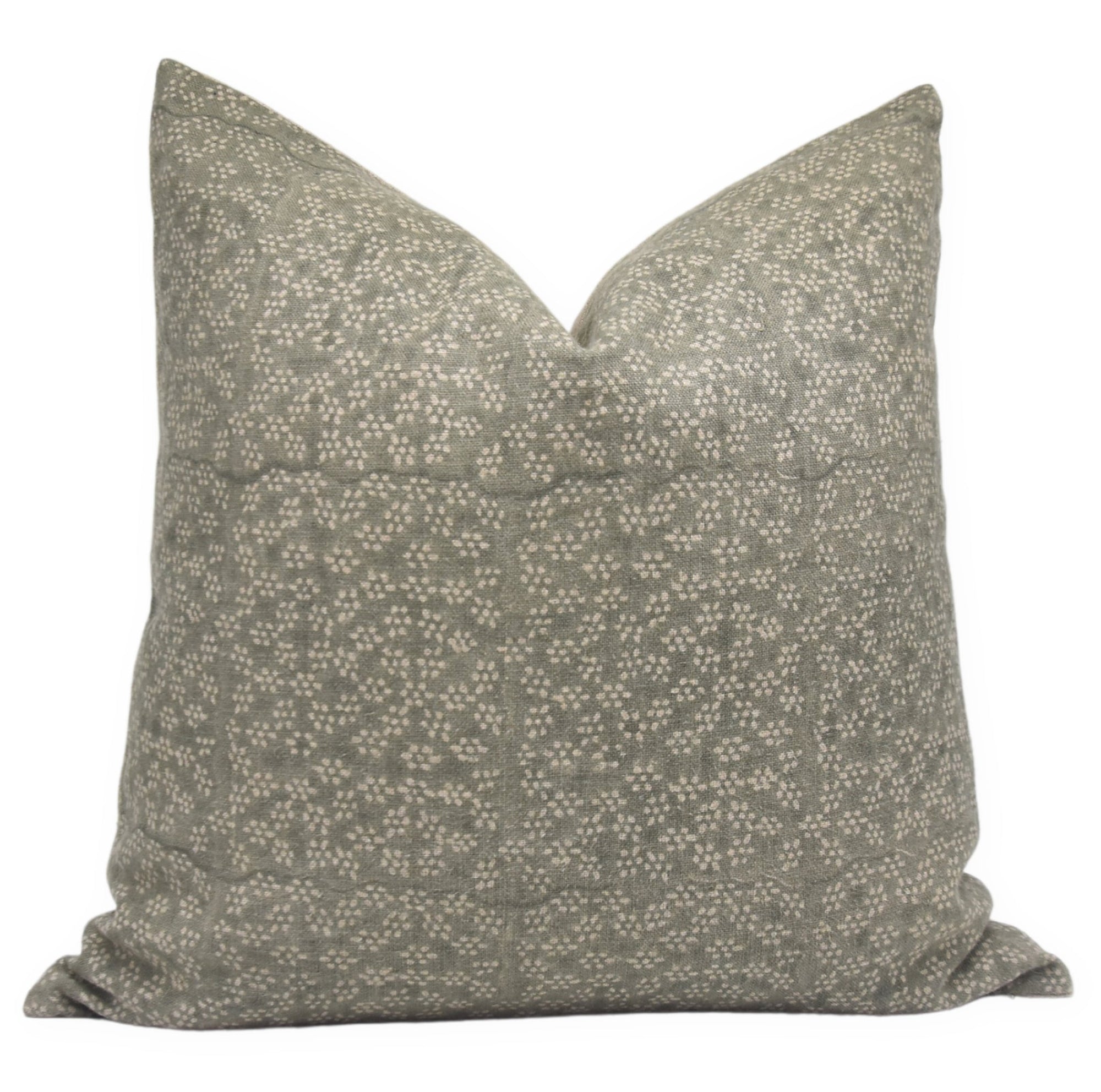
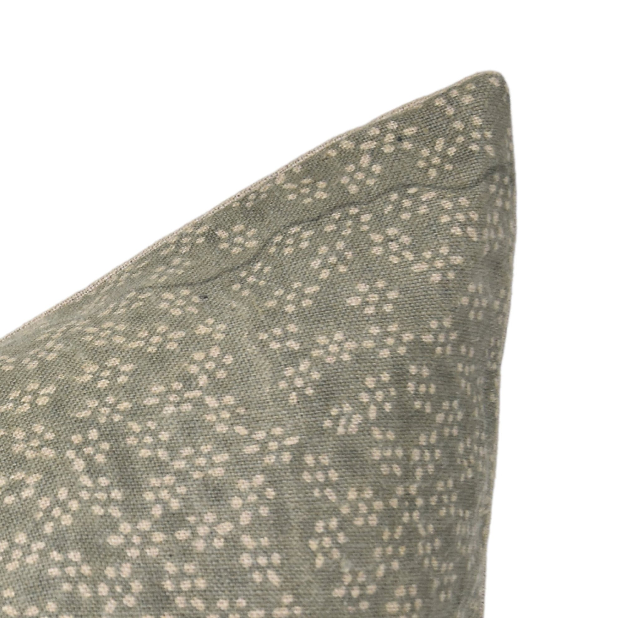
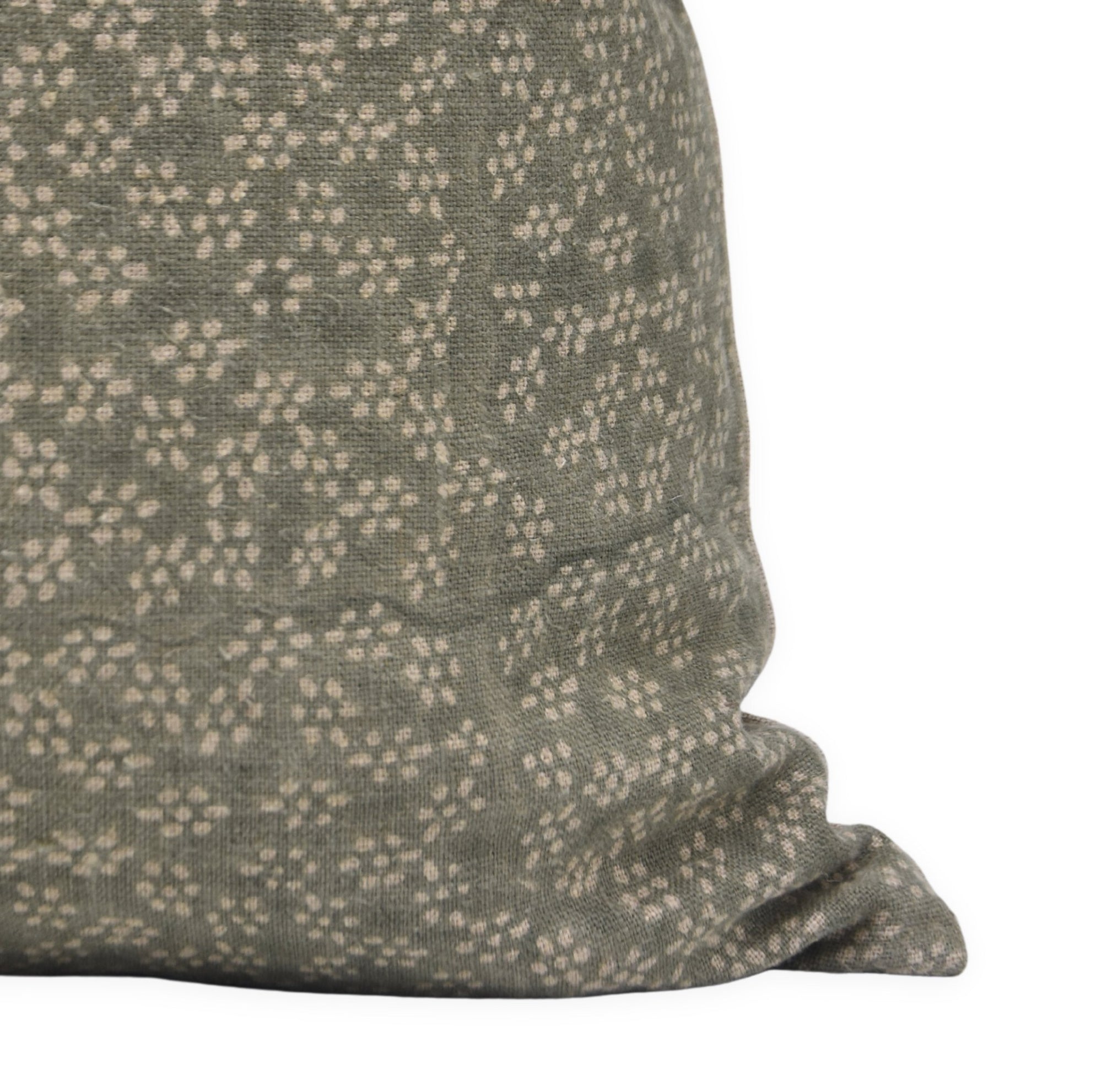
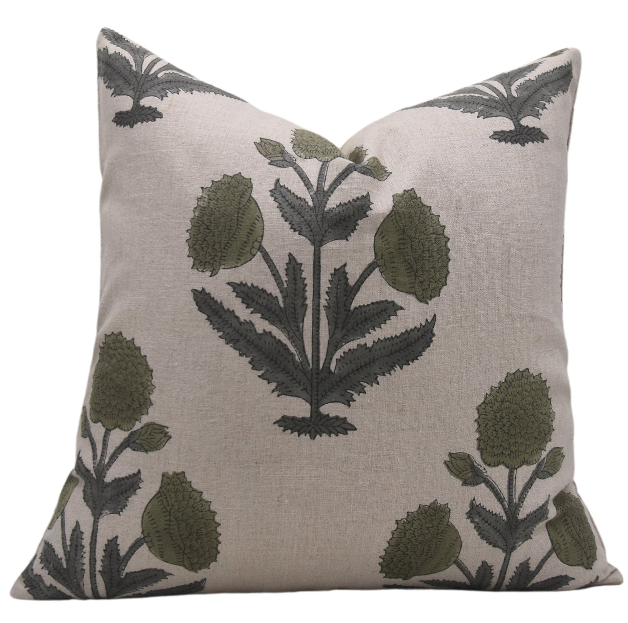
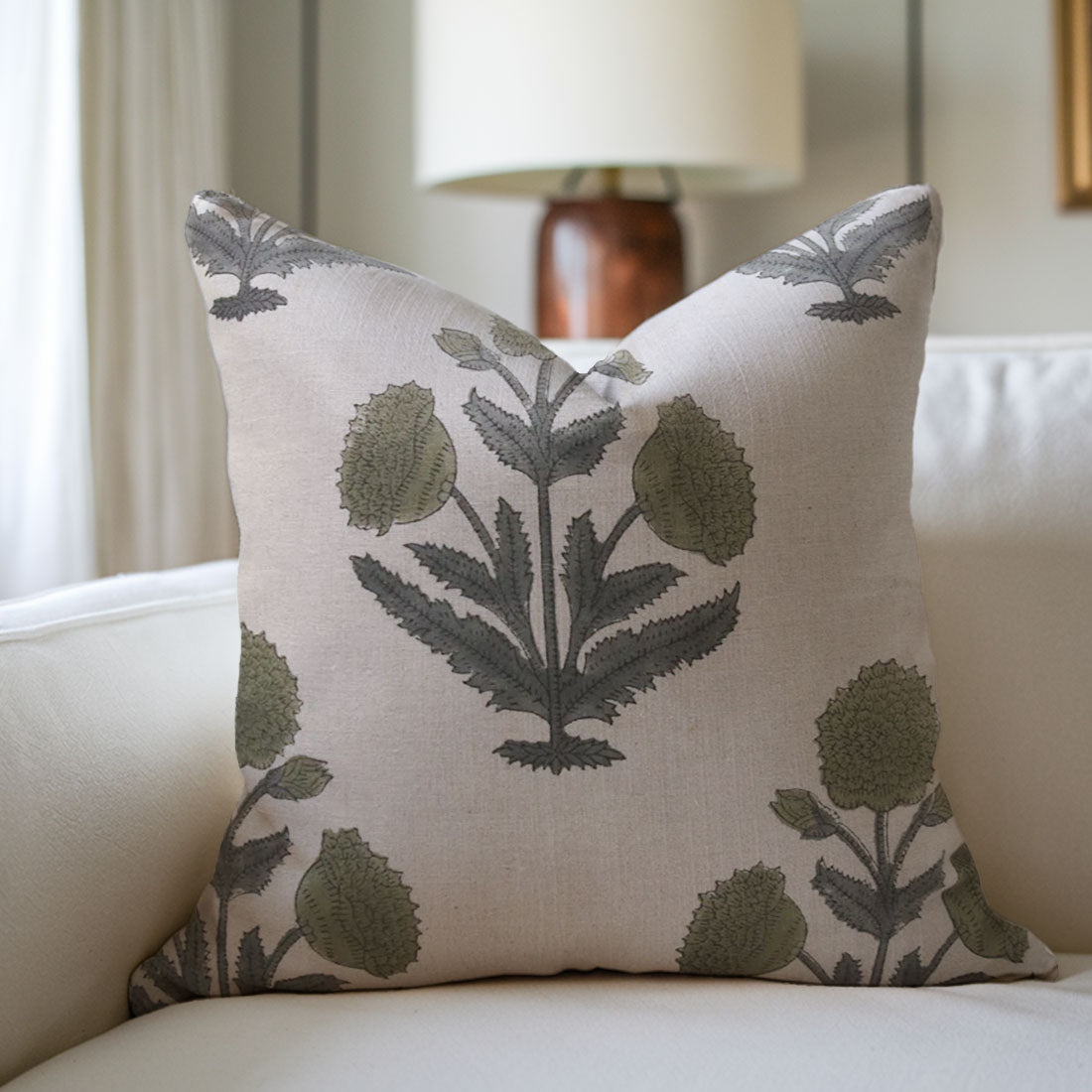
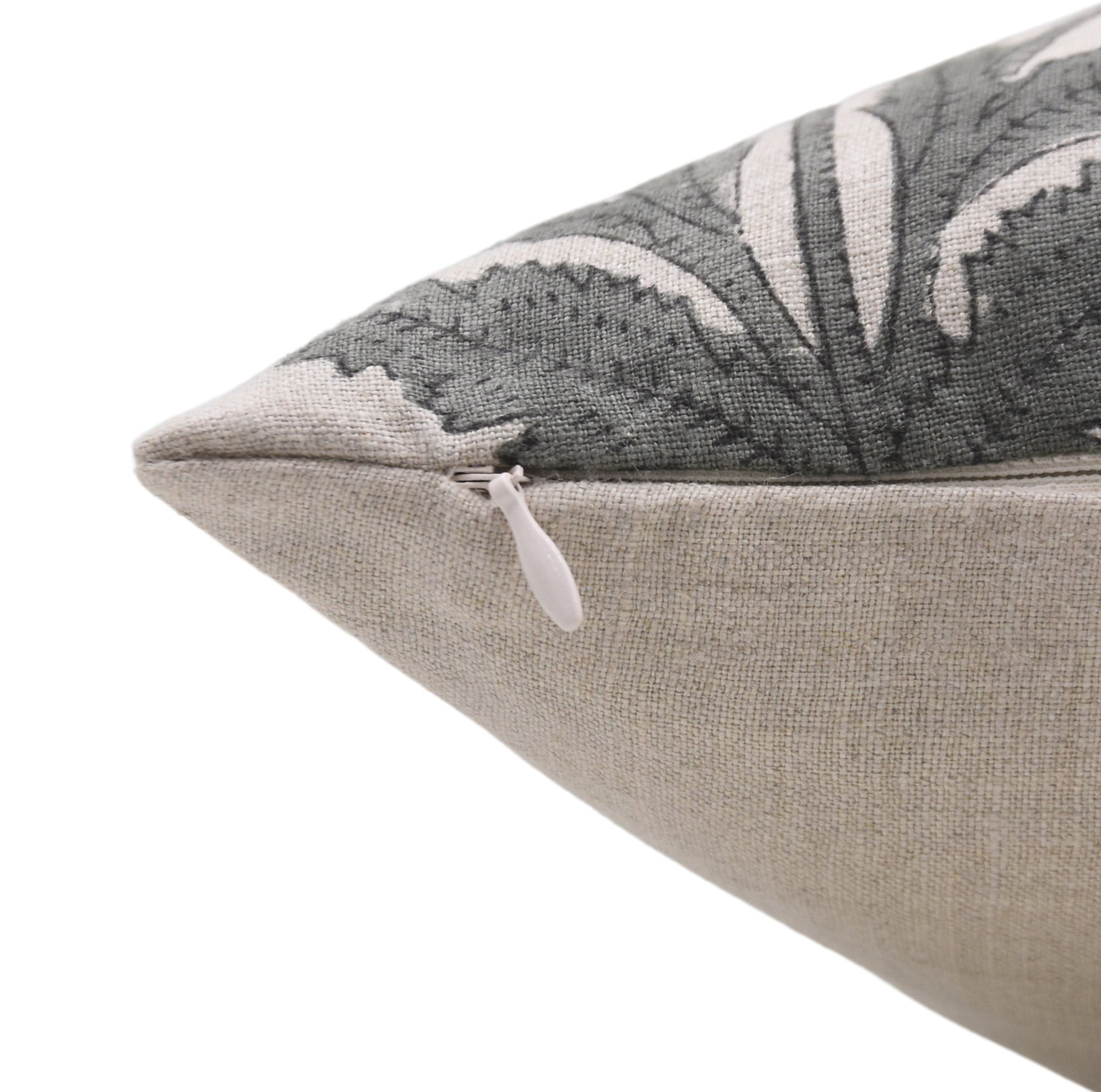
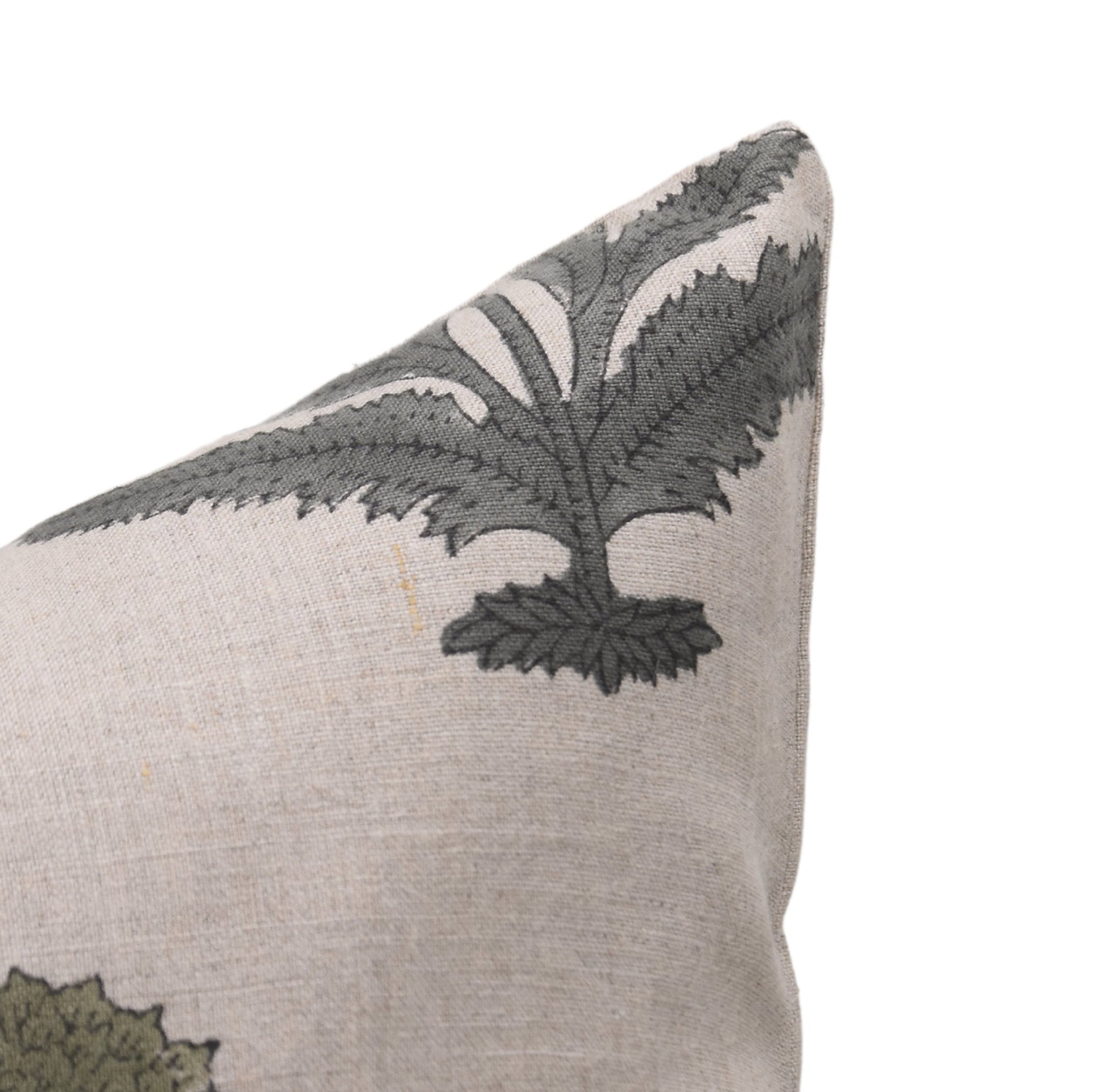
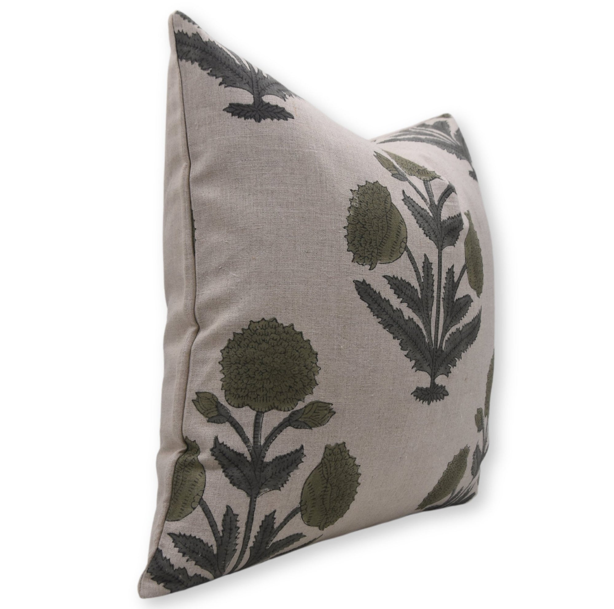
When it's about selecting the best curtain color for living room spaces, earth tones never disappoint. Shades like olive green, off-white, and terracotta are some top cozy tones that add a grounded feeling and comfort. These colors easily match with wooden floors and plants beautifully. Makes the room feel warm without being overpowering.
If your living room reflects lots of sunlight, then these tones help decrease brightness gently without dulling your space. Earth tones strike a balance between casual and elegance, making them ideal for relaxed and shiny mornings.
-
Dining Room: Bring Red And Orange Energy To The Table
Psychology says, using colors like red and orange stimulates appetite and liveliness, which is why these colors work well in dining rooms. Such as cherry red color and deeper shades like burnt orange provide richness without overwhelming the space. Curtain color psychology suggests warm tones help to elevate energy and make them ideal for gatherings and meals.
To avoid visual fatigue, bold hues are usually balanced with neutral walls or furniture. Using fabrics with a matte finish can tone down intensity and allow colors to speak without shouting.

-
Bedroom: Where Curtains And Tones Matter The Most
For bedrooms, the goal is often stillness. The top picks in the curtain color guide for bedrooms are soft blues, green shades, and muted lavenders promote calm and restful sleep. And if you want a more dramatic look, then Navy blue or charcoal gray curtains will do that job by creating a cozy cocoon effect. Especially when it is paired with blackout liners.
This color psychology will help you to understand certain color theory that prepares your brain for relaxation and sleep. Stick to matte textures or soft cottons that feel relaxed and not overly formal. Your bedroom should be a stress-free zone, and with curtains, you can level up the game.
-
Home Office Or Study: When Focus Meets Calmness
Color can affect productivity, and home offices or study rooms should be designed in such a way that can increase your attention span. Such as this color guide explains how your mind perceives some colors.
-
Using color like Green is an excellent choice because it’s associated with growth, balance, and concentration. Think olive, sage, or even a deeper forest green for a grounding effect.
-
Choosing the blue color. Blue is another solid pick if you work in a high-stress job. Such as light to medium blues can reduce anxiety and improve focus without being distracted. Avoid very dark shades unless the room is covered with ample natural light.
For curtain design tips, consider a layered curtain look with sheers and thicker panels to make the space look more flexible. Fabrics should be structured to match the room’s purposeful energy.
-
Small Rooms or Hallways: Light Neutrals is the key
For small rooms or hallways, choosing curtain colors that enhance the space is the key. With some room-specific curtain ideas, you can make your room look spacious:-
-
Neutral tones in lighter shades like ivory, soft grey, or beige can make a room feel more accepting and bright because these colors reflect natural light.
-
Hanging your curtains higher than your window frame and extending the rod past the window’s width can also change the perception of height and width.
These subtle adjustments, combined with the right curtain color psychology, can redesign your packed areas into airy retreats.
-
Bold Accent Statement: Rich Tones Weds Rich Fabrics
Looking for a bold accent statement? Then, rich tones like sapphire blue, emerald green, and burgundy can bring a sense of luxury and depth to any room. They work as the best curtain colors for a living room if you want to add drama or richness. Pair these bold colors with velvet or silk fabrics to enhance their opulence, especially if your walls and furniture are of neutral shades. This approach works well in rooms where lower lighting enhances the color’s richness.

-
High-Daylight Rooms: A dreamy effect to your space
Rooms with lots of windows often attract daylight, and the goal is to manage light without sacrificing brightness.
Here’s how to choose a curtain color to create a dreamy effect from sunlight:-
-
Pale colors like dove grey, blush, or linen white paired with sheer or lightly textured fabrics work beautifully in more window rooms. These curtain colors diffuse harsh sunlight and add a soft glow to the room.
-
Satin or silk finishes can reflect light subtly by maintaining the room’s brightness while adding elegance.
With this color guide, nail your space by balancing darkness with daylight.
-
Matching or Contrasting Wall with Curtains: For more Drama & Harmony
Any idea how to choose a curtain color if you want to match it with your walls? Well, matching your curtain color to the wall creates a clean and seamless look that makes a room feel larger and more peaceful. Makes it a great choice for minimalist or modern aesthetics. On the other hand, contrasting curtains add visual interest and energy.
A smart curtain design tip is to follow the 60-30-10 color rule. For example, your dominant color should be the walls, secondary color (curtains), and accent color (decor); follow this proportion to maintain balance.
Final Verdict:-
Curtains are not only window dressings. They help in shaping the mood, function, and vibe of a room, too. This color guide helped you in approaching a unique selection, based on both practical and emotional needs. Whether you're aiming for energy in a dining room or peace in your bedroom, making the right curtain color choice can elevate the space. So, let your curtain choices lift the interiors of your home.
FAQs:-
How To Choose a Curtain Color If My Wall Paint Is Neutral?
Neutral walls always ensure flexibility. So you should search for bold with rich tones or keep it soft with pastels or earth tones for a cohesive look.
Should Bedroom Curtains Be Darker Or Lighter Than The Walls?
The choice is yours. But, Darker curtains add more privacy and coziness, whereas lighter curtains are airy and keep the room bright.
What Curtain Colors Help A Small Room Look Bigger?
Light neutral reflects more light and visually expands space, especially if you match it closely with the wall color.
How Can Natural Light Affect Curtain Color Choice?
Natural light intensifies color, bright rooms benefit from light-colored sheer curtains to maintain openness, while dark rooms handle bold tones without feeling heavy.